


Color Your World: Mastering the Art of Exterior Home Design
Updated on : 05 February, 2025
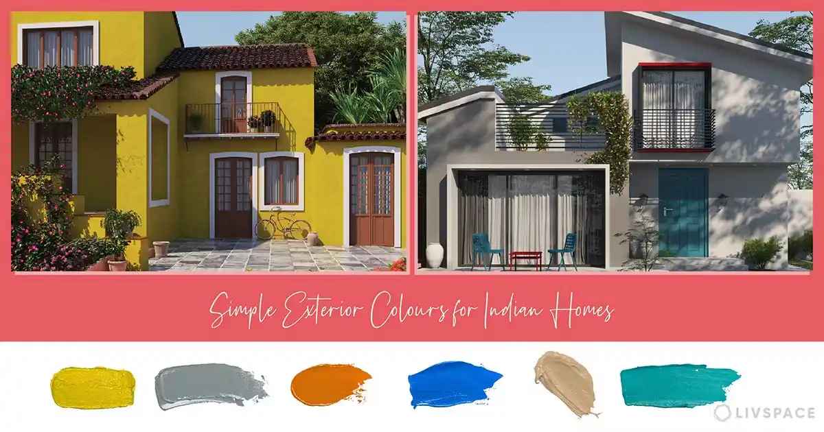
Image Source: facebook.com
Table Of Contents

- 1. Understanding Exterior Color Design for Your Home
- 2. The Importance of Exterior Color
- 3. Popular Exterior Color Combinations
- 4. Color Combination Table
- 5. Cultural Influences on Color Choice
- 6. Psychological Effects of Color
- 7. Practical Tips for Choosing Exterior Colors
- 8. The Role of Lighting in Color Perception
- 9. Impact of Surrounding Landscape
- 10. The Use of Texture in Color Design
- 11. Sustainability Considerations
- 12. Conclusion
Table Of Contents

Understanding Exterior Color Design for Your Home
-
Choosing the right exterior color for your home is a transformative process that significantly enhances its curb appeal and reflects your personal style. This guide explores the art of exterior color design, highlighting popular combinations like Sage Green and Terracotta for an earthy vibe or Cream and Rustic Red for a classic contrast.
-
Understanding cultural influences can also guide your choices, as certain colors resonate differently in various contexts. Additionally, consider the psychological effects of colors; warm tones can evoke energy while cool shades promote tranquility.
-
Practical tips, such as testing samples in different lighting and considering seasonal changes, will help you make informed decisions. By mastering these elements, you can create a stunning exterior that not only stands out but also harmonizes beautifully with its surroundings. Embrace the opportunity to color your world and make a lasting impression with your home For more inspiration and expert advice, visit HexaHome.
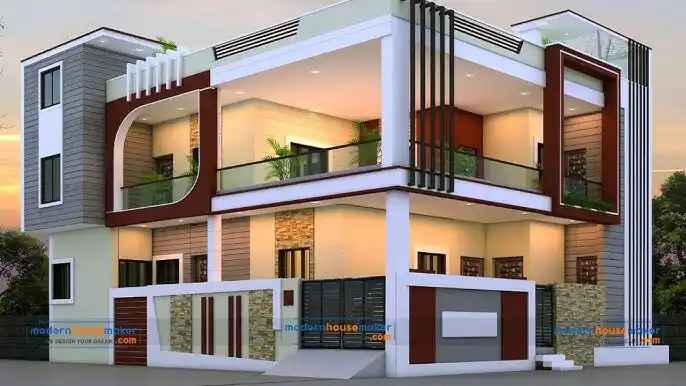
Image Source: amazonaws.com
The Importance of Exterior Color
The exterior color of a home serves several essential functions:
- Curb Appeal: A well-chosen color can enhance the visual appeal of your home, making it stand out in the neighborhood.
- Value Addition: Homes with attractive exteriors tend to have higher market values.


- Reflecting Style: The color can express your personal style and complement architectural features.
- Environmental Harmony: Colors can help your home blend into its natural surroundings, creating a cohesive look.
Popular Exterior Color Combinations
Choosing the right color combination is vital for achieving a balanced and aesthetically pleasing look. Here are some popular combinations to consider:
-
White and Indigo
- Description: This classic combination uses white as the dominant color, accented by indigo touches that add depth and sophistication.
- Benefits: It creates a fresh, clean look that resonates well with modern aesthetics while providing excellent contrast.
-
Peach and White
- Description: An elegant choice, peach paired with white creates a clean and classy look.
- Benefits: The soft tones are perfect for those who prefer subtlety over boldness and evoke warmth.

Image Source: amazonaws.com
-
Grey and White
- Description: This minimalist combination offers a sleek and modern appearance.
- Benefits: Grey serves as a neutral base while white accents elevate the overall design, making it versatile for various architectural styles.
-
Butter Yellow and White
- Description: A cheerful combination, butter yellow brings warmth and brightness to the exterior, complemented beautifully by white trim.
- Benefits: This pairing is perfect for creating an inviting atmosphere that feels welcoming.
-
Red and Cream
- Description: This bold yet elegant pairing combines the vibrancy of red with the softness of cream.
- Benefits: It creates a striking visual impact that draws attention while maintaining sophistication.

-
Sage Green and Stone
- Description: For those who prefer earthy tones, sage green paired with stone elements evokes tranquility.
- Benefits: This combination connects the home to nature, making it ideal for rural or wooded settings.
-
Navy Blue and Light Gray
- Description: Navy blue provides a strong foundation while light gray adds a soft contrast.
- Benefits: This combination is timeless and works well for both traditional and contemporary homes.
-
Charcoal and Bright Yellow
- Description: Charcoal serves as a dark base, while bright yellow accents provide a pop of color.
- Benefits: This modern pairing is eye-catching and energetic, perfect for urban settings.
-
Earthy Terracotta and Cream
- Description: Terracotta brings warmth reminiscent of natural clay, paired with creamy whites for balance.
- Benefits: This combination works well in warmer climates and complements Mediterranean architecture beautifully.

-
Soft Lavender and White
- Description: Soft lavender creates a gentle touch when paired with crisp white trim.
- Benefits: This soothing palette is perfect for coastal homes or gardens.
-
Turquoise and Coral
- Description: A vibrant pairing that reflects beachy vibes, turquoise combined with coral creates an inviting atmosphere.
- Benefits: Ideal for coastal homes, this combination celebrates nature’s palette.
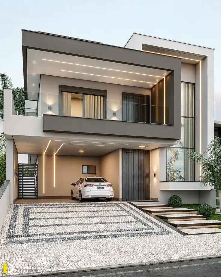
Image Source: amazonaws.com
- Chocolate Brown and Olive Green
- Description: A rich chocolate brown base complemented by olive green accents creates an earthy feel.
- Benefits: This combination is perfect for homes surrounded by nature, providing a rustic charm.
For more ideas on enhancing your home's exterior or to find your dream property, check out our listings in pune and Lucknow.
Color Combination Table
| Color Combination | Description | Benefits |
|---|---|---|
| Cream & Brown | A warm, inviting palette that blends with nature. | Creates a rustic and cozy atmosphere. |
| White & Blue | A classic pairing that evokes coastal charm. | Brightens the exterior and adds freshness. |
| Yellow & Brown | A cheerful combination that radiates warmth. | Adds vibrancy and a friendly feel to the home. |
| Grey | A versatile neutral that suits various architectural styles. | Provides sophistication and modernity. |
| White, Grey & Black | A chic, contemporary trio that offers striking contrast. | Enhances visual interest while remaining elegant. |
| Brick Red, Grey & White | A bold combination that adds depth and character. | Creates a timeless look with a touch of tradition. |
| Sage Green & Stone | Earthy tones that connect the home to its surroundings. | Promotes tranquility and harmony with nature. |

Cultural Influences on Color Choice
In many cultures, certain colors hold specific meanings or are traditionally preferred for homes:
- Indian Homes
- Colors like peach, cream, and vibrant reds are popular due to their cultural significance.
- Vastu Shastra principles influence color choices, encouraging harmonious combinations that promote positive energy.
- Coastal Styles
-
In coastal regions, bright colors like turquoise or coral are often used to reflect the vibrant surroundings.
-
These colors evoke feelings of relaxation and joy associated with beach life.

Image Source: amazonaws.com
- Mediterranean Influence
- Mediterranean-style homes often feature warm earth tones like terracotta or sandy beige to mimic the natural landscape of coastal areas in Southern Europe.
- These colors create a cozy yet vibrant atmosphere that invites relaxation.
Psychological Effects of Color
Understanding how colors affect mood can guide your choice:
- Warm Colors (Red, Orange, Yellow)
- These colors evoke feelings of warmth and comfort but can also stimulate energy levels.
- They are often used to create welcoming environments; however, excessive use may lead to feelings of agitation.
- Cool Colors (Blue, Green)
- Cool colors promote calmness and tranquility; they are ideal for creating serene spaces.
- They work well in areas where relaxation is desired, such as patios or gardens.

- Neutral Colors (Gray, Beige)
- Neutrals provide balance and can make spaces feel larger.
- They serve as excellent backdrops for more vibrant accents but may require careful consideration to avoid appearing dull or lifeless.
Practical Tips for Choosing Exterior Colors
When selecting colors for your home's exterior, consider these practical tips:
-
Analyze Your Environment
- Take note of neighboring homes and natural surroundings. Choose colors that complement rather than clash with these elements.
-
Test Samples
- Always test paint samples on your walls before making a final decision. Observe how they look at different times of day under varying lighting conditions.
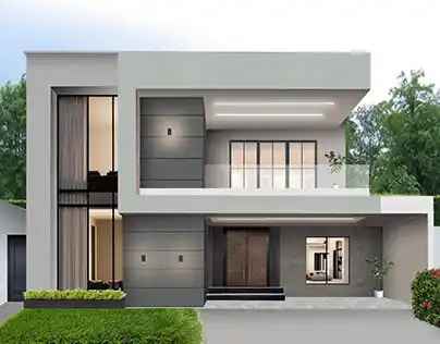
Image Source: amazonaws.com
-
Consider Architectural Style
- The architectural style of your home should guide your color choices. Traditional homes often look best in classic colors, while modern designs can accommodate bolder hues.
-
Think About Maintenance
- Lighter colors may require more upkeep as they can show dirt more easily than darker shades. Choose weather-resistant paints to ensure longevity.
-
Seasonal Considerations
- Consider how seasonal changes affect color perception; some colors may appear different in winter versus summer light conditions.

-
Future Trends vs. Timeless Choices
- While it’s tempting to follow trends, opt for timeless colors that won’t feel dated in a few years.
-
Consult Professionals
- If unsure about your choices, consult with an interior designer or color consultant who can provide expert advice tailored to your home’s unique features.
-
Use Technology Tools
- Many paint companies offer online tools that allow you to visualize different colors on your home’s exterior before making a commitment.
-
Consider Local Climate
- The local climate can affect how colors appear over time; lighter colors may fade faster in sunny areas while darker shades might absorb heat more effectively in colder climates.
-
Community Guidelines
- Some neighborhoods have guidelines regarding exterior colors; check these regulations before finalizing your choices to ensure compliance.
-
Personal Connection
- Choose colors that resonate personally with you—colors that evoke happy memories or reflect your personality will make you feel more at home in your space.

- Accents Matter
- Don’t forget about trim, doors, shutters, and other accents! These elements can dramatically change the overall look when paired with your main color choice.
The Role of Lighting in Color Perception
Lighting plays a significant role in how we perceive color, influencing not only the appearance of hues but also the overall mood of a space. Here are some key factors to consider:
- Natural Light vs. Artificial Light:
- Natural light enhances colors differently than artificial light. Sunlight varies in intensity and quality throughout the day, affecting how colors are seen. For instance, colors may appear vibrant and true in bright daylight but can look washed out under dim artificial lighting. Understanding the type of light your home receives can help you choose colors that look their best.

-
Time of Day Influence:
- Colors can appear warmer during sunrise or sunset due to the softer, golden tones of early and late daylight. This phenomenon can dramatically alter the perception of your chosen shades, making it essential to test paint samples at various times throughout the day to see how they change with shifting light conditions.
-
Light Source Types:
- Different artificial light sources emit varying color temperatures, which can affect perception. For example, incandescent bulbs produce warm light that enhances yellows and reds, while fluorescent lights emit cooler tones that might make colors appear sharper but less inviting. LED lights can vary widely in warmth and brightness, so selecting the right type for your home is crucial.
-
Seasonal Changes:

Image Source: amazonaws.com
- Seasonal variations also impact color perception. In winter, natural light may be cooler and less intense, altering how colors are viewed compared to the bright, warm sunlight of summer. This seasonal shift is important to consider when planning exterior color schemes.
By understanding these factors, you can make informed decisions about your color choices, ensuring that your home's exterior looks stunning in any light!
Impact of Surrounding Landscape
The landscape surrounding your home can influence color choices:
- Natural Elements
- Incorporate colors found in nature around your home—like greens from trees or blues from water features—to create harmony between your house and its environment.
- Urban vs. Rural Settings
- Urban settings might benefit from bolder hues to stand out against concrete backdrops, while rural areas may call for softer tones that blend into natural landscapes.
The Use of Texture in Color Design
Texture plays a pivotal role in enhancing the visual appeal of exterior paint, adding depth and character to your home’s facade. Here’s how to effectively incorporate texture into your color design:
- Matte vs. Glossy Finishes:
- Matte Finishes: These finishes absorb light, creating a soft, muted look that can evoke a sense of warmth and tranquility. Matte paints are excellent for hiding imperfections and can be particularly effective on surfaces with intricate details, like trim or moldings.
- Glossy Finishes: In contrast, glossy finishes reflect light, adding vibrancy and a polished look to your home. They are ideal for highlighting architectural features and can create a striking contrast against matte surfaces. However, glossy finishes may require more upkeep, as they tend to show dirt and imperfections more readily.
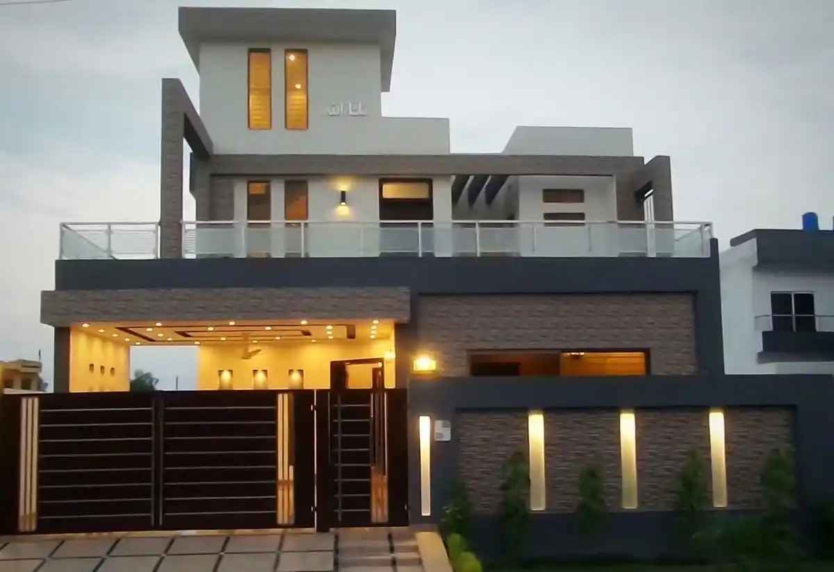
Image Source: amazonaws.com
-
Combining Textures:
- Experimenting with different textures can elevate your exterior design. For instance, pairing smooth stucco with rough-hewn wood siding creates visual interest and contrasts that draw the eye. You can also mix materials like brick, stone, or metal accents to further enrich the texture palette.
- Accent Features: Consider using textured elements like decorative moldings or textured panels to break up large surfaces and add dimension. These accents can be painted in complementary colors to enhance their visibility and impact.
-
Layering Techniques:
- Layering different textures within the same color family can create a sophisticated monochromatic scheme that feels rich and inviting. For example, a soft beige wall paired with darker beige wooden shutters can add depth without overwhelming the overall aesthetic.
By thoughtfully integrating texture into your exterior color design, you can create a dynamic and visually engaging home that reflects your personal style while standing out in the neighborhood.
Sustainability Considerations
Incorporating sustainable practices into your color choices not only benefits the environment but also enhances the longevity and appeal of your home. Here are some key considerations to keep in mind:

- Eco-Friendly Paints:
- Opt for low-VOC (volatile organic compounds) paints that are better for indoor air quality and reduce environmental impact. These paints emit fewer harmful chemicals, making them safer for your family and pets. Additionally, many eco-friendly paints are made from natural ingredients, offering a sustainable alternative to traditional options.
- Energy Efficiency Through Color Choices:
- Lighter colors reflect sunlight better than darker shades, which can help keep homes cooler in hot climates. This natural cooling effect can reduce reliance on air conditioning, leading to lower energy bills and a smaller carbon footprint. Conversely, in cooler climates, darker colors can absorb heat, helping to maintain warmth during winter months.
- Sustainable Sourcing:
- Consider paints made from sustainably sourced materials. Brands that prioritize eco-friendly practices often use renewable resources and minimize waste in their production processes.
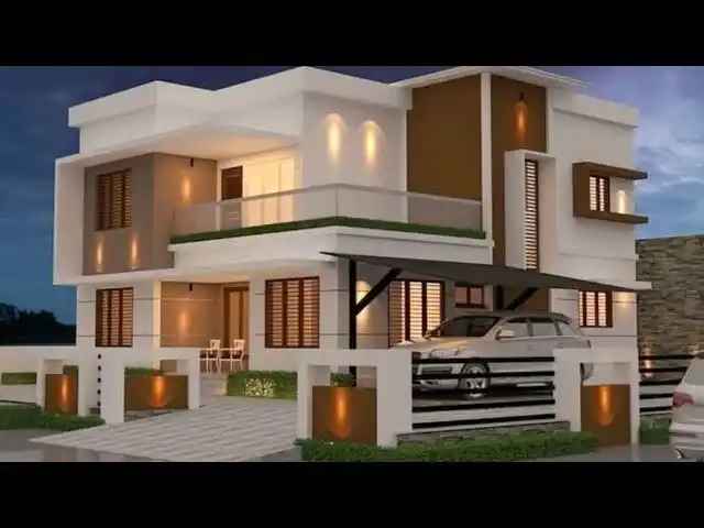
Image Source: amazonaws.com
- Durability and Longevity:
- Choose high-quality paints that offer durability and weather resistance. Longer-lasting finishes reduce the need for frequent repainting, which in turn decreases waste and resource consumption.

- Recycling and Disposal:
- When it's time to refresh your home’s exterior, ensure that old paint is disposed of properly or recycled. Many local waste management facilities have programs for recycling paint, helping to keep harmful chemicals out of landfills.
By embracing these sustainable practices in your exterior color choices, you can create a beautiful home that aligns with your values while contributing positively to the environment.
Conclusion
The exterior color design of your house is an opportunity to express your style while enhancing its beauty and value. By considering popular color combinations, cultural influences, psychological effects, practical tips—and most importantly—taking time to choose thoughtfully—you can select an exterior palette that not only looks great but also harmonizes beautifully with its environment. Remember that the right color will welcome you home for years to come!
If you're ready to embark on your journey toward finding the perfect property, explore our stunning listings at HexaHome and discover your dream home today!

India's Best Real Estate Housing App
Scan to Download the app

Download HexaHome app now.
Available on iOS & Android


Loved what you read? Share it with others!


Explore Properties for Sale in noida:
- Apartments for Sale in Sector 107 Noida
- Apartments for Sale in Sector 121 Noida
- Apartments for Sale in Sector 128 Noida
- Apartments for Sale in Sector 72 Noida
- Apartments for Sale in Sector 150 Noida
- Apartments for Sale in Sector 76 Noida
- Apartments for Sale in Sector 73 Noida
- Apartments for Sale in Sector 52 Noida
- Apartments for Sale in Sector 51 Noida
- Apartments for Sale in Sector 143 Noida
- Builder Floors for Sale in Sector 107 Noida
- Builder Floors for Sale in Sector 104 Noida
- Builder Floors for Sale in Bhangel Noida
- Builder Floors for Sale in Sector 72 Noida
- Builder Floors for Sale in Divine Meadows Noida
- Builder Floors for Sale in Sector 108 Noida
- Builder Floors for Sale in Gadi Choukhandi Noida
- Builder Floors for Sale in Sector 73 Noida
- Retail Shop for Sale in Phase II Noida
- Retail Shop for Sale in Sector 129 Noida
- Retail Shop for Sale in Sector 94 Noida
- Retail Shop for Sale in Sector 98 Noida
- Retail Shop for Sale in Sector 140 A Noida
- Retail Shop for Sale in Sector 50 Noida
- Retail Shop for Sale in Sector 105 Noida
- Retail Shop for Sale in Sector 110 Noida
- Office Space for Sale in Sector 140 A Noida
- Office Space for Sale in Sector 129 Noida
- Office Space for Sale in Sector 142 Noida
- Showroom for Sale in Sector 98 Noida
- Showroom for Sale in Sector 129 Noida
- Warehouse for Sale in Sector 82 Noida
Explore Properties for Rent in noida:
- Apartments for Rent in Sector 75 Noida
- Apartments for Rent in Sector 137 Noida
- Apartments for Rent in Chhaprauli Bangar Noida
- Apartments for Rent in Noida Extension Noida
- Apartments for Rent in Sector 78 Noida
- Apartments for Rent in Sector 63 Noida
- Apartments for Rent in Sector 74 Noida
- Apartments for Rent in Sector 70 Noida
- Apartments for Rent in Sector 142 Noida
- Apartments for Rent in Sector 48 Noida
- Villa for Rent in Rwa Noida
- Villa for Rent in Sadarpur Noida
- Villa for Rent in Sector 41 Noida
- Villa for Rent in Sector 19 Noida
- Office Space for Rent in Bajidpur Noida
- Office Space for Rent in Sector 142 Noida
- Office Space for Rent in Sector 144 Noida
- House for Rent in Sector 19 Noida
- House for Rent in Sector 142 Noida
- House for Rent in Sector 67 Noida
- Builder Floors for Rent in Sector 122 Noida
- Builder Floors for Rent in Bhangel Noida
- Builder Floors for Rent in Sector 142 Noida
- Retail Shop for Rent in Sector 78 Noida
- Retail Shop for Rent in Sector 106 Noida
- 1 Rk Studio for Rent in Sector 70 Noida
- 1 Rk Studio for Rent in Sector 51 Noida
Explore Plots for sale in noida:
- Plot for Sale Sector 4 Noida
- Plot for Sale Kulesara Noida
- Plot for Sale Phase II Noida
- Plot for Sale Samastpur Noida
- Plot for Sale Sector 16a Noida
- Plot for Sale Sector 17 Noida
- Plot for Sale Sector 128 Noida
- Plot for Sale Bhangel Noida
- Plot for Sale Sector 2 Noida
- Plot for Sale Sector 142 Noida
- Commercial Plot for Sale in Sector 92 Noida
Explore PG’s for Rent in noida:
- PG’s for Rent in Sector 19 Noida
- PG’s for Rent in Sector 15 Noida
- PG’s for Rent in Sector 71 Noida
- PG’s for Rent in Sector 62 Noida
- PG’s for Rent in Sector 137 Noida
- PG’s for Rent in Sector 72 Noida
- PG’s for Rent in Sector 92 Noida
- PG’s for Rent in Sector 27 Noida
- PG’s for Rent in Sector 49 Noida
- PG’s for Rent in Sector 18 Noida
Explore Co-living options in noida:
- Sharing Room/Flats in Sector 75 Noida
- Sharing Room/Flats in Sector 74 Noida
- Sharing Room/Flats in Sector 76 Noida
- Sharing Room/Flats in Sector 70 Noida
- Sharing Room/Flats in Sector 137 Noida
- Sharing Room/Flats in Sector 77 Noida
- Sharing Room/Flats in Sector 51 Noida
- Sharing Room/Flats in Sector 52 Noida
- Sharing Room/Flats in Sector 55 Noida
- Sharing Room/Flats in Sector 134 Noida
- Sharing Room/Flats in Sector 117 Noida
- Sharing Room/Flats in Sector 63 Noida
- Sharing Room/Flats in Sector 92 Noida


Buy, Sell & Rent Properties – Download HexaHome App Now!

Find your perfect home, PG, or rental in just a few clicks.

Post your property at ₹0 cost and get genuine buyers & tenants fast
 Smart alerts & search helps you find homes that fit your budget.
Available on iOS & Android
A Product By Hexadecimal Software Pvt. Ltd.

Scan to Download our App
Available on iOS & Android – Download Now!


Loved what you read? Share it with others!